
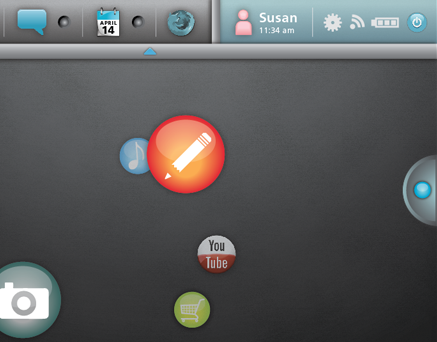
Elden Ring UX/UI Study
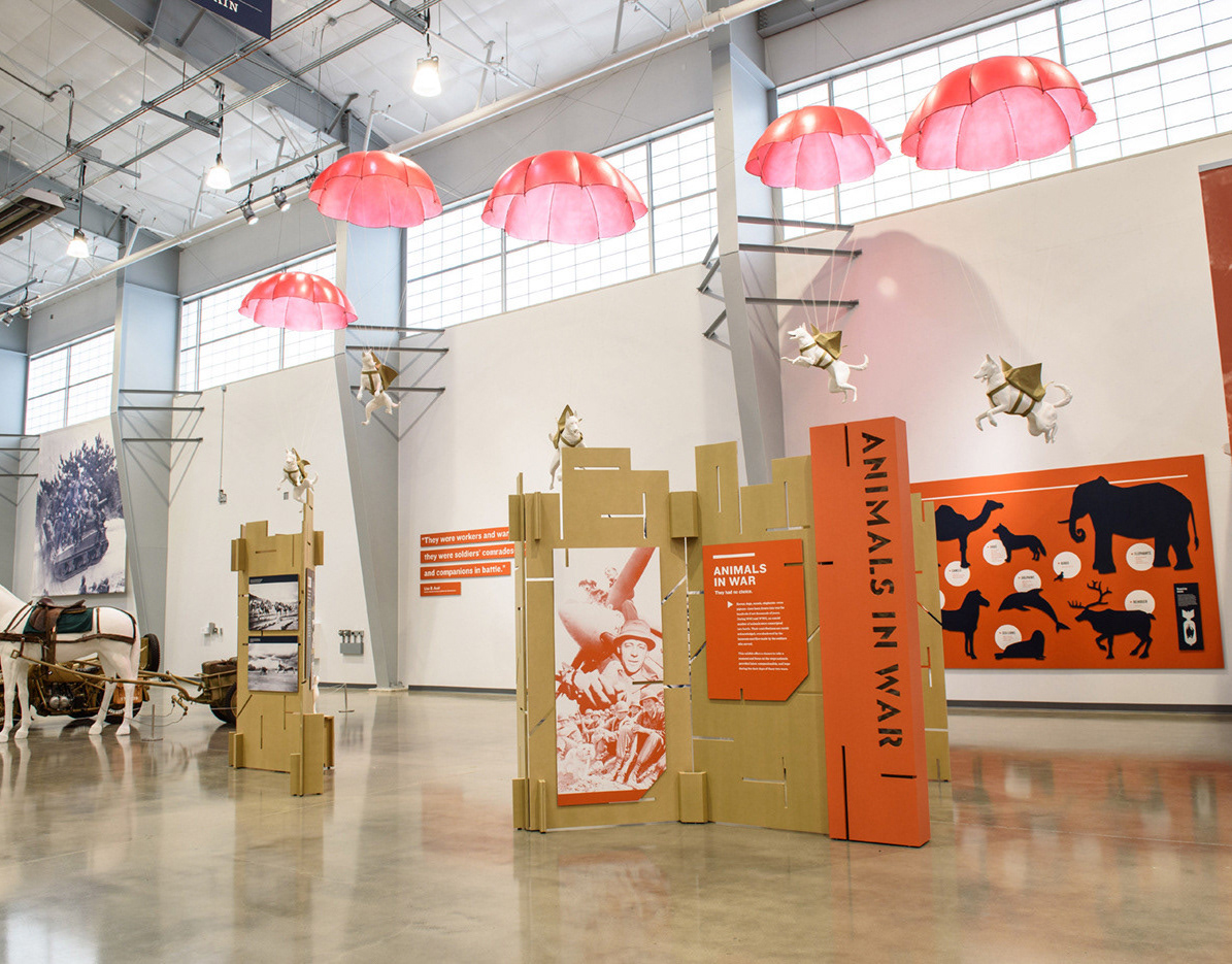
Animals In War and Life In A Tank Exhibits
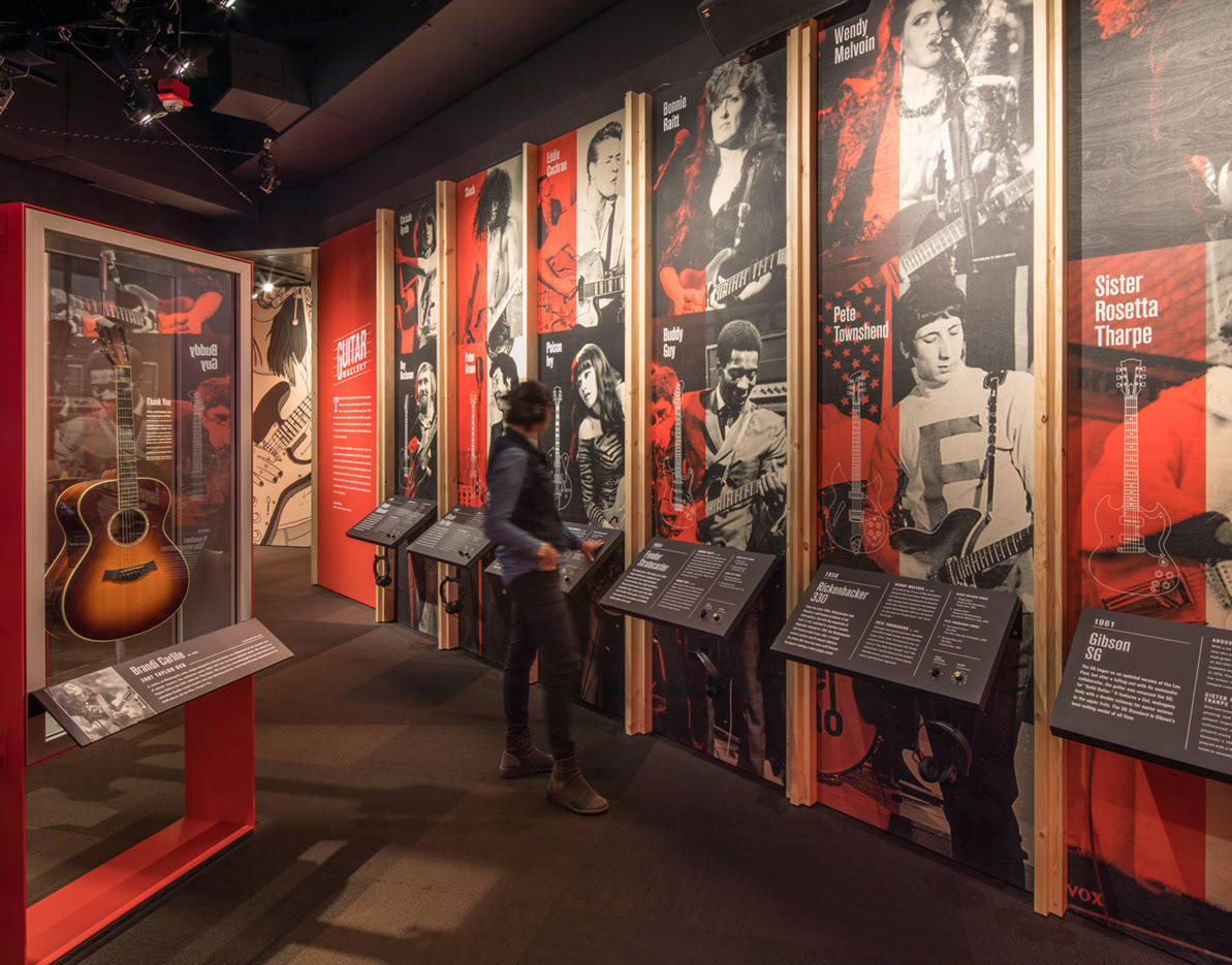
Guitar Gallery Exhibit Design
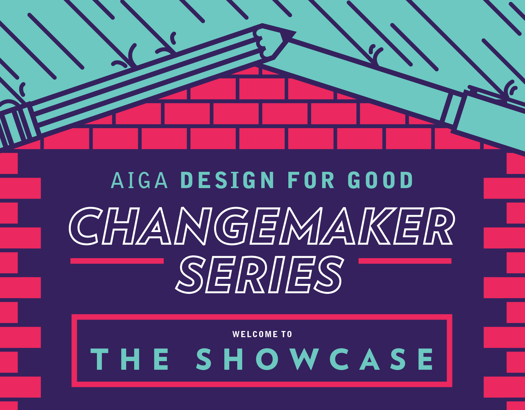
AIGA Changemaker Series Marketing
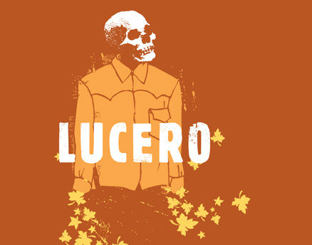
Lucero Album Packaging
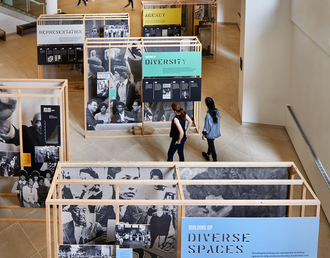
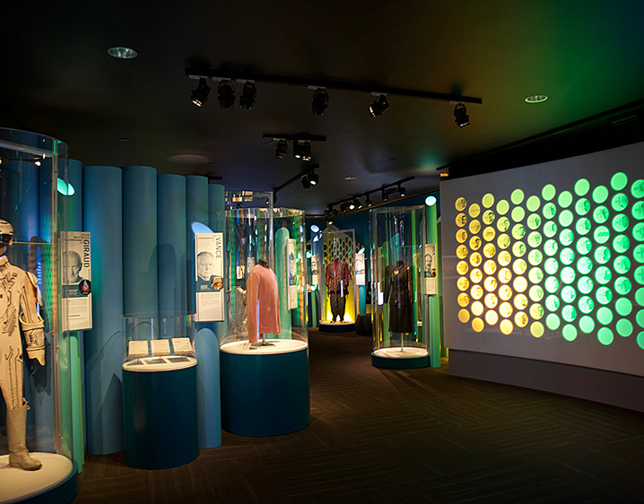
UW’s Office of Minority Affairs & Diversity Exhibit
Selected Posters
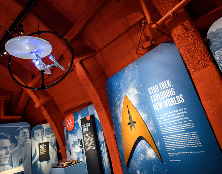
Star Trek: Exploring New Worlds Exhibit Graphics
Seattle Academy of Arts & Sciences Signage
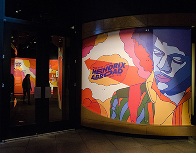
Hendrix Abroad Exhibit Design
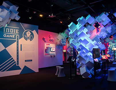
Indie Game Revolution Exhibit Graphics
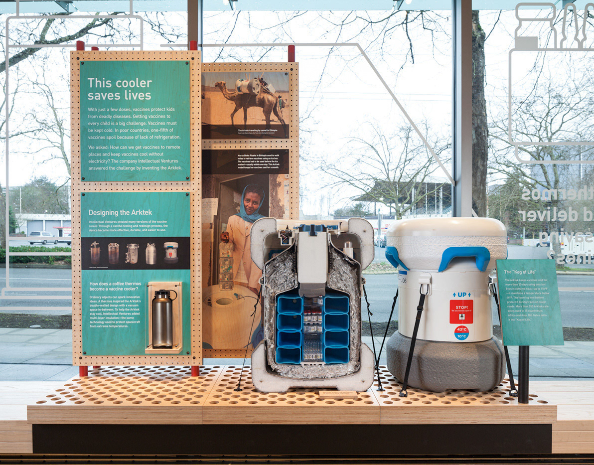
Gates Foundation Discovery Center Exhibit Displays
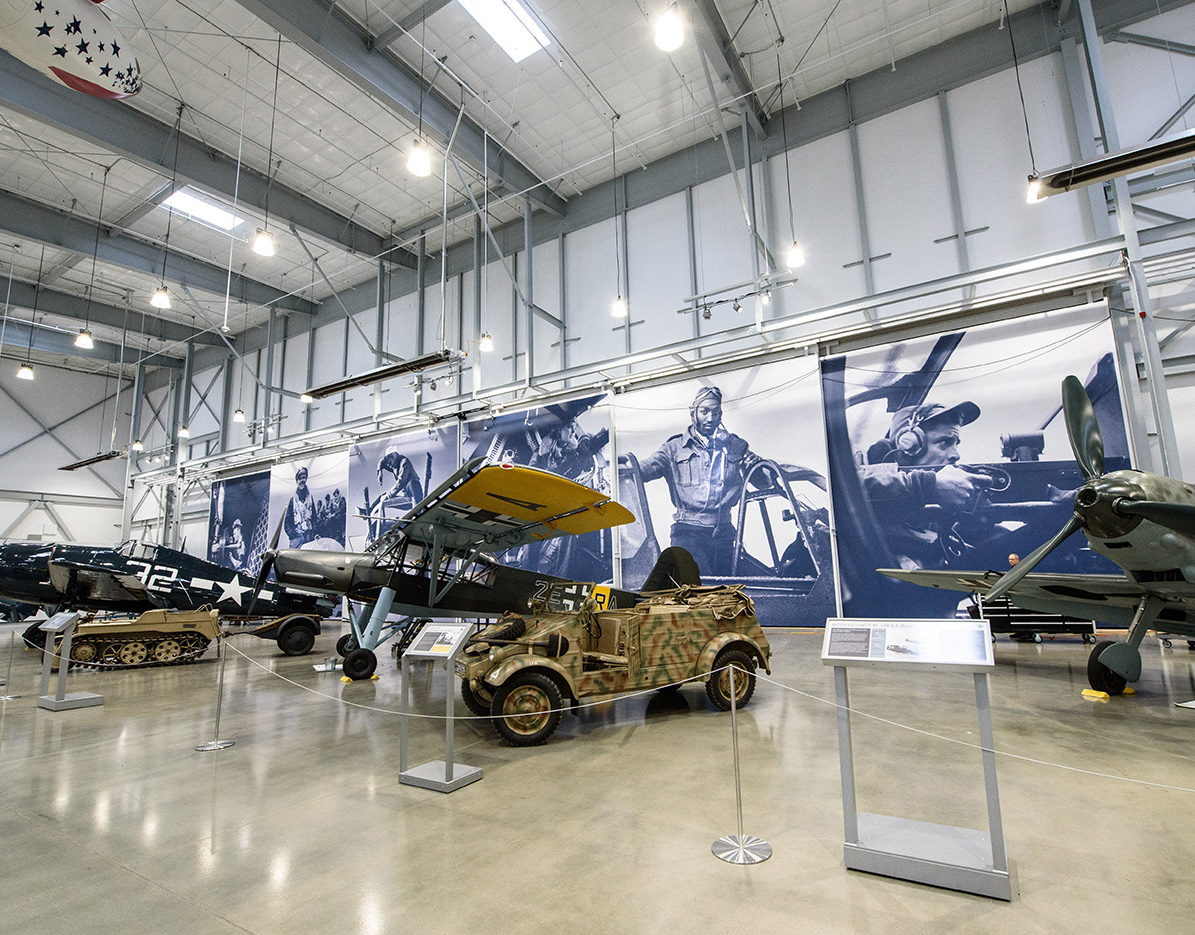
Hangar 3 Environmental Graphics
Pacific Northwest Ballet Signage
Science Fiction & Fantasy Hall of Fame Exhibit Design
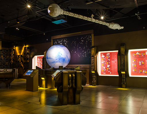
Infinite Worlds of Science Fiction Exhibit Graphics
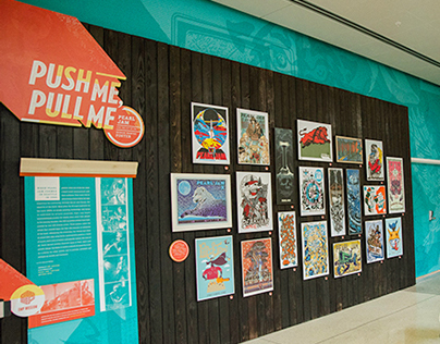
Push Me, Pull Me Pearl Jam Poster Exhibit Design
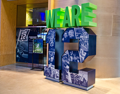
We Are 12 Exhibit Design
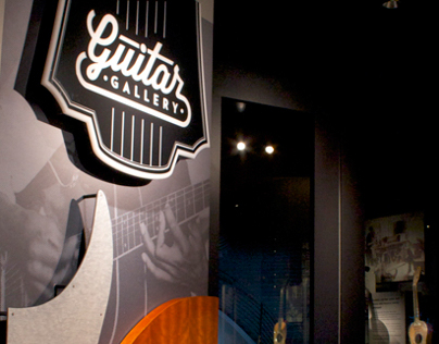
Guitar Gallery Graphic Refresh
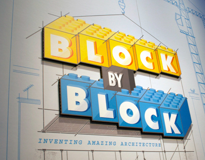
Block By Block Exhibit Design
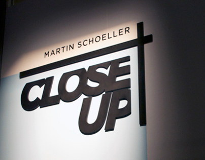
Martin Schoeller: Close Up Exhibit Design
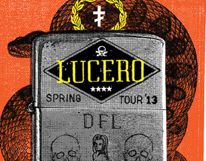
2013 Lucero Posters
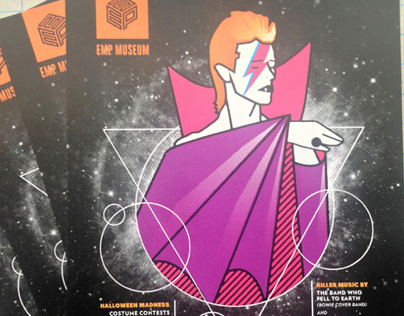
Bowie Invades Promo Work
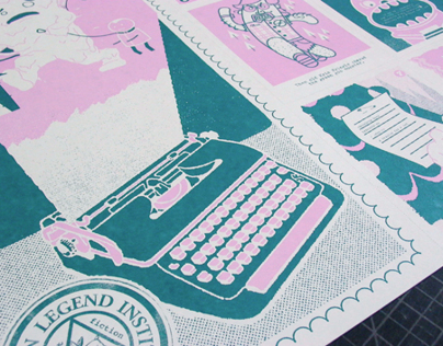
Urban Legend Institute Poster
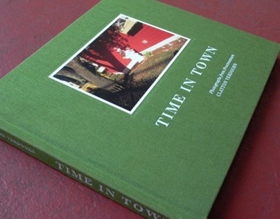
Time In Town Book Layout
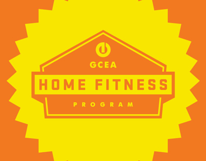
GOOD Ideas For Cities Cincinnati — Home Fitness Program
Freescale Netbook Project

Hudson Hill and Woodville Design Management Project
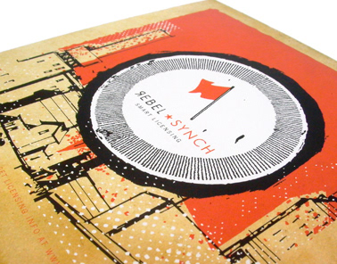
Rebel Synch Logo and Implementations
Lucero T-Shirts
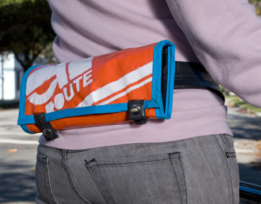
En Route Bike Maintenance Kit
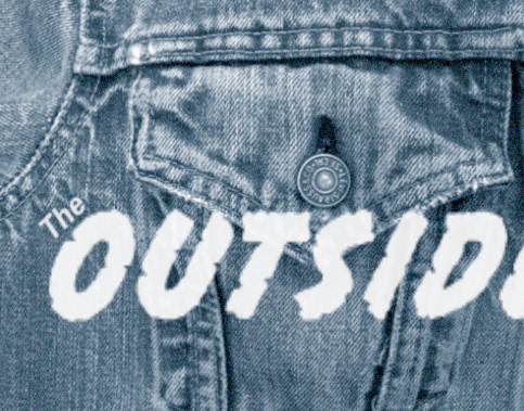
The Outsiders Opening Titles
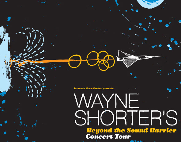
Wayne Shorter Beyond the Sound Barrier
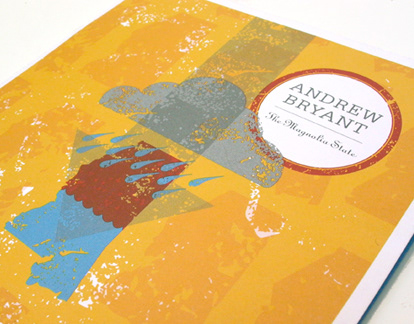
Andrew Bryant / The Magnolia State
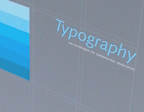
Typography Book
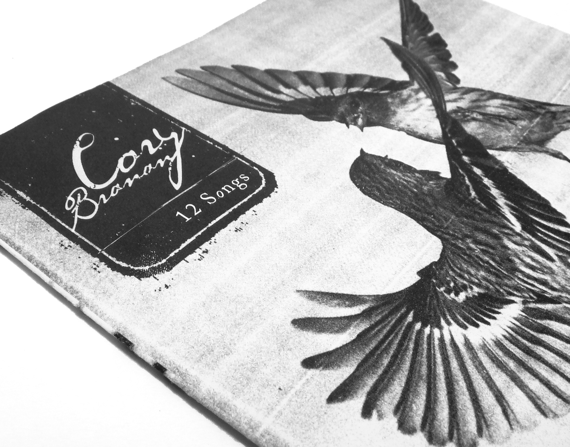
Cory Branan / 12 Songs
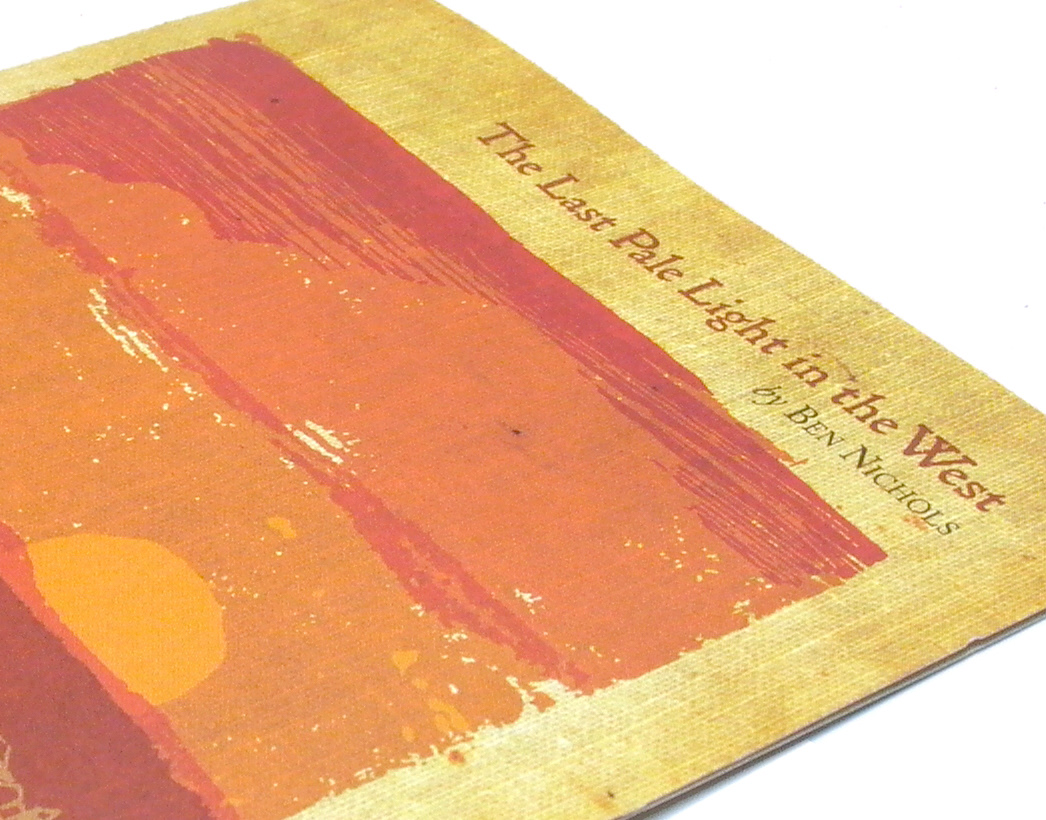
Ben Nichols / The Last Pale Light in the West

Neighbors Project

Cuyler Brownsville Anti-Crime Campaign